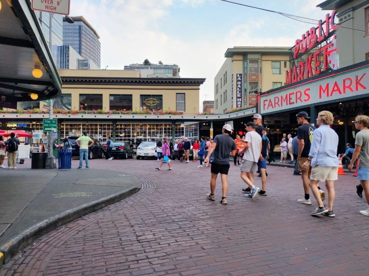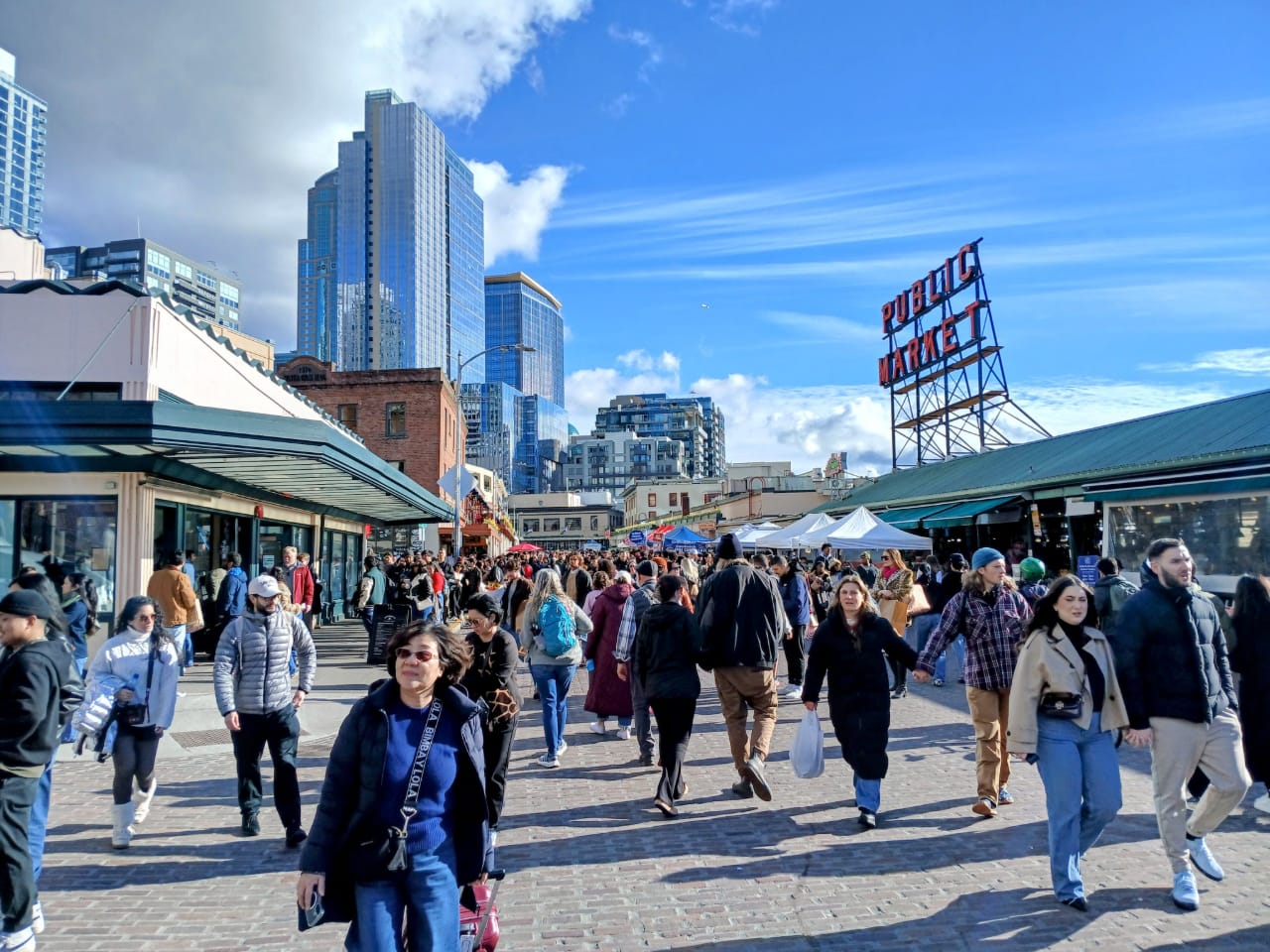
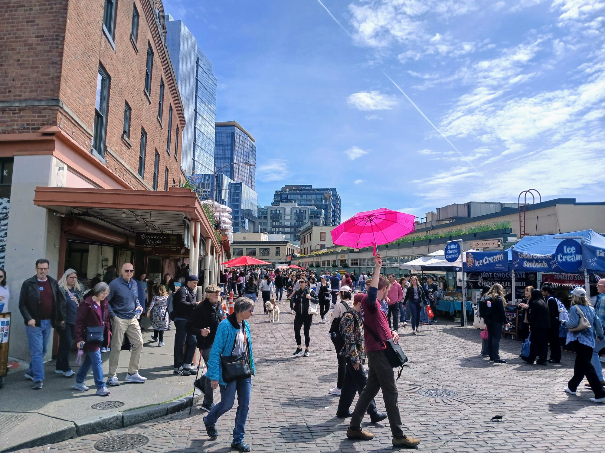
Limiting car access to Pike Place to better welcome foot traffic has been a boon to Pike Place Market visitation and sales, according to newly released data. Commercial tenant sales rose 6.5% in 2025 compared to 2024, after the implementation of a "test and learn" pilot vehicle access strategy at Pike Place Market early last spring.
Sales at retail stores within the Market rose 9.2%, with restaurants seeing a 10.2% boost between May and September, the busiest season at Seattle's most popular public market. The number of visitors who live within 30 miles of the Market increased by 5.6% from one year to the next, a figure that translates to an additional 127,000 Puget Sound residents dropping by Pike Place at some point in 2025.
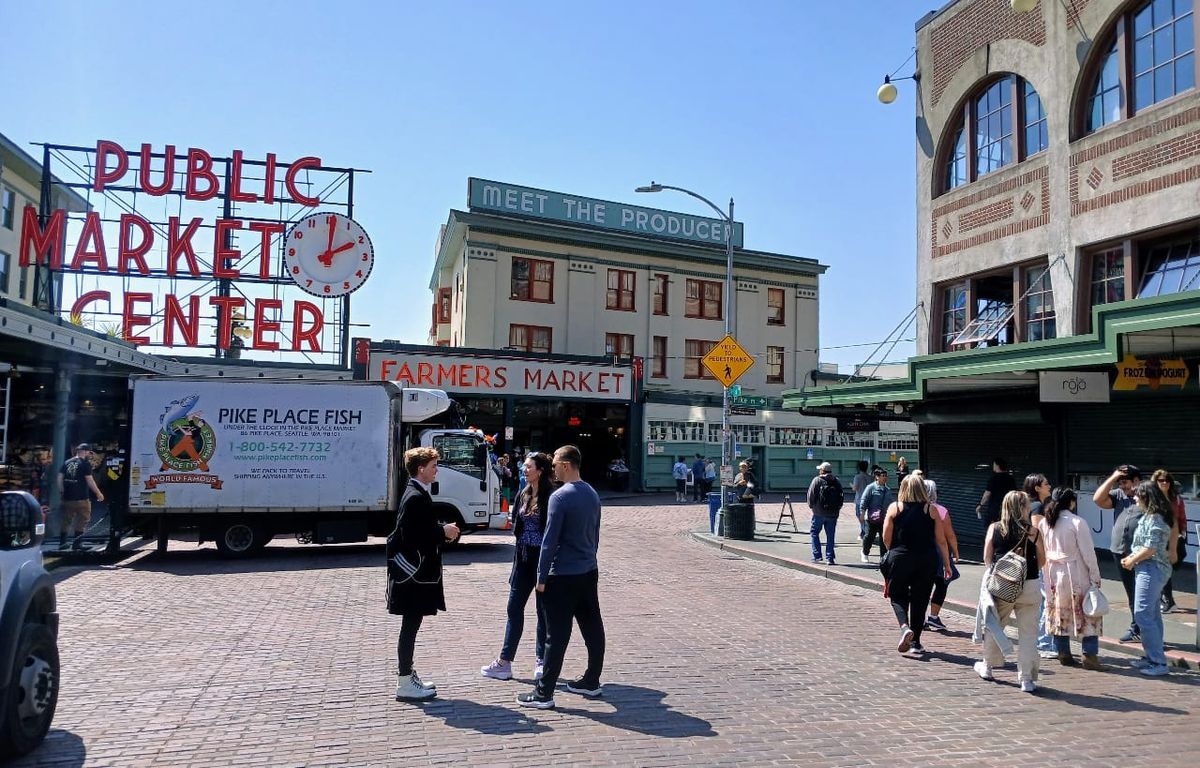
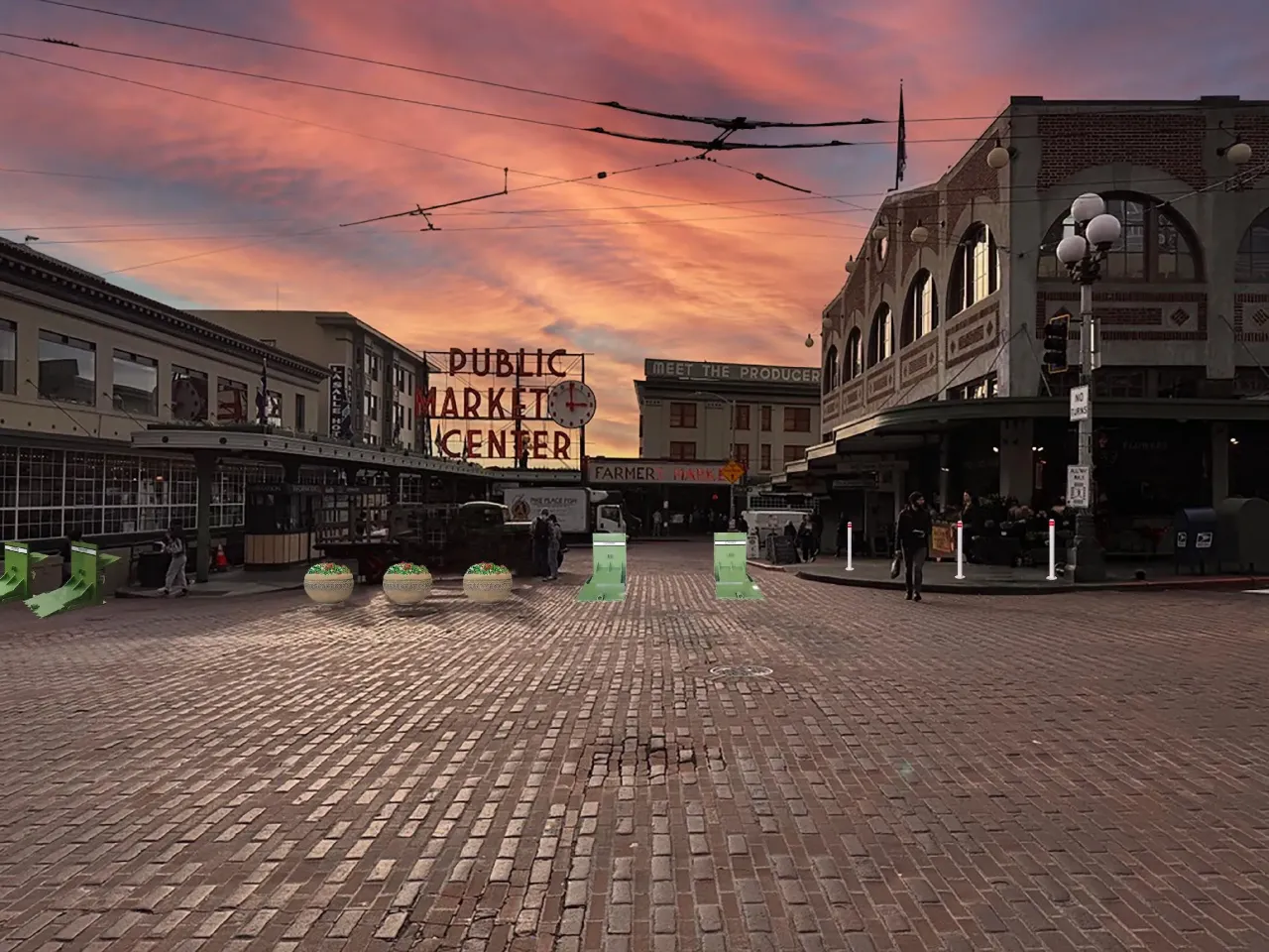
These new numbers, presented to the Pike Place Public Development Authority (PDA) Executive Committee last week, strongly bolster the case for considering permanent pedestrianization infrastructure at the Market. Under the pilot, vehicle access to Pike Place is restricted from 10am to 4pm everyday, with exceptions provided for drivers making deliveries, those needing ADA access, and emergency vehicles, with all drivers able to access the street earlier in the morning and in the evening.
Initially set to last a year, the pilot has been extended at least through Labor Day of 2026, as PDA leaders – tasked with managing day-to-day operations at the Market – work with city officials and other stakeholders to determine what the Market's new normal will be.
In the coming weeks, the Seattle Department of Transportation (SDOT) will install additional hardening infrastructure at the Market's primary entrances, changes that will allow full closures of Pike Place on FIFA Men's World Cup match days. Those updates include bollards along sidewalk edges that will prevent any drivers from ignoring new movable, crash-rated barricades of the type commonly seen near parade routes.
The Market Historical Commission, a City-established board that oversees the historically-designated preservation district encompassing the entire Market, granted temporary approval for these changes that only extends until this fall.
Ultimately, the 2025 data backs up what seems crystal clear in practice to many Seattleites: blocking a relatively small number of drivers from being able to careen down the middle of Pike Place at their leisure at any time of day has made one of Seattle's most iconic public spaces much more welcoming.
"I can speak to my experience over the months that this pilot has been going, and say that it's been an immense improvement," Seattle resident Soren Smith told the historical commission in February, as it was considering whether to approve the interim vehicle barriers. "I think that limiting who's allowed would make it easier to get deliveries in and out, [and] make it easier for longtime, valued customers who may, for whatever reason, need to drive to the Market to get in and not have to deal with just the continual line of traffic from one end to the other down the main street that was there for most of the day prior to the pilot."
Which is not to say that everyone's onboard – far from it. Some of the most skeptical voices when it comes to access changes have been members of Friends of the Market, the advocacy group formed in 1964 to push for preservation of the Market in the face of potential proposals that would have seen it demolished. The group, which is provided two votes on the Market Historical Commission, is just one element of a complex ecosystem of groups that are seen as direct stakeholders when it comes to any potential changes to the Market. (Full disclosure: I served on the Friends of the Market board between 2014 and 2016.)
"While those who want the street closed might wax rhapsodic about the joys of being able to meander down the middle of a car-free street, there are businesses who tell of losing long-time customers to the confusion of encountering STREET CLOSED signs at Market entrances thoughout [sic] much of the day for most of last year," Christine Vaughan, a Friends board member, wrote in the organization's monthly newsletter this month. "Some of these businesses are the legacy grocery sellers: businesses that have been at the Market for 40 or 50 years or even longer, now severely impacted to the point of questioning the viability of continuing their presence in the Market."
Despite the PDA's data showing that produce sales were up 8.1% year-over-year, some produce vendors have indeed voiced concerns about losing their existing customer base.
"Customers come in cars. That's the thing. In the advent of opening up the waterfront, they took away 300 parking spaces and didn't replace them with anything. Now, they're expecting people to come down and there's nowhere to park," Mike Osborn, the owner of Sosio's Produce, told KING 5 last year.
In fact, the Marketfront, the new addition to the Market facing the waterfront that opened in 2017, came with 300 parking stalls that went a long way to replacing the parking stalls that used to sit under the long-demolished Alaskan Way Viaduct. That garage supplements the hundreds of additional parking stalls available around the Market. The number of parking spaces along Pike Place pales in comparison to the number of off-street stalls, but many longtime Market advocates have been pushing for SDOT to increase the amount of time customers can park along the street to accommodate longer shopping trips.
But even surveys of Market business owners had shown that the idea of pedestrianizing the street was broadly popular – before this new data showing the positive impact on sales and visits across the entire district.
The future of the Market is set to come back into the spotlight this fall, after a working group develops recommendations that are set to inform SDOT's request to the historical commission. As hinted by SDOT staff working on the project, that recommendation could include installation of retractable bollards.
In the meantime, the first deployment of the vehicle barricades as part of a full closure of Pike Place is expected on May 9, for Pike Place's 18th Annual Flower Festival.